Redesigning the Peddlr Homepage for Clarity, Simplicity, and Accessibility
TL;DR: In just 3 days, I redesigned the homepage of a mobile POS app as part of a job application design challenge. By reducing visual clutter, simplifying navigation, and improving accessibility, I created a clearer and more intuitive interface—especially for users new to digital tools.
Company
Peddlr
Type
Design Challenge
Role
Product Designer
Tools
Figma, Figjam
Timeline
3 week
Impact
Improved clarity, usability, and accessibility through homepage redesign
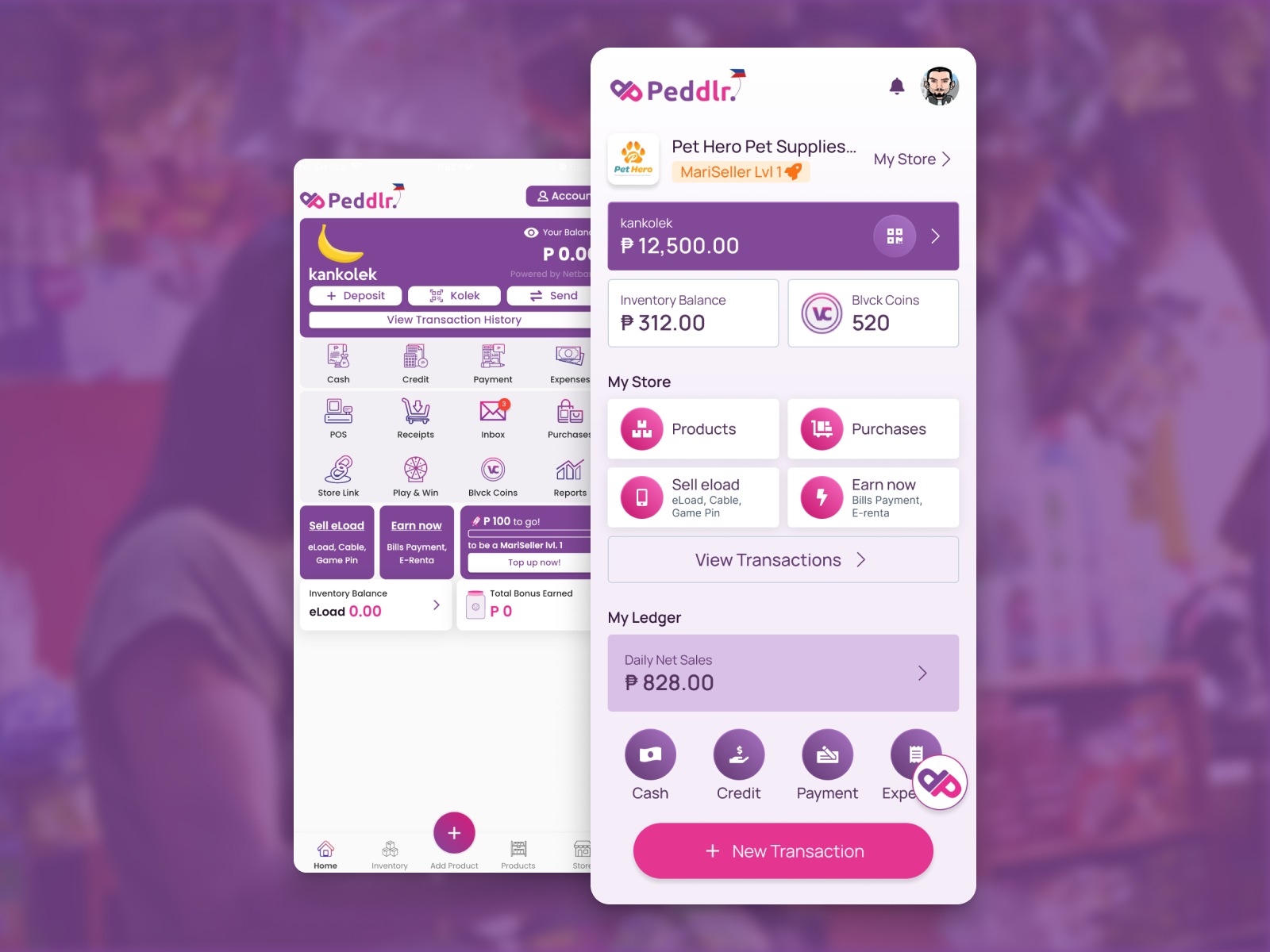
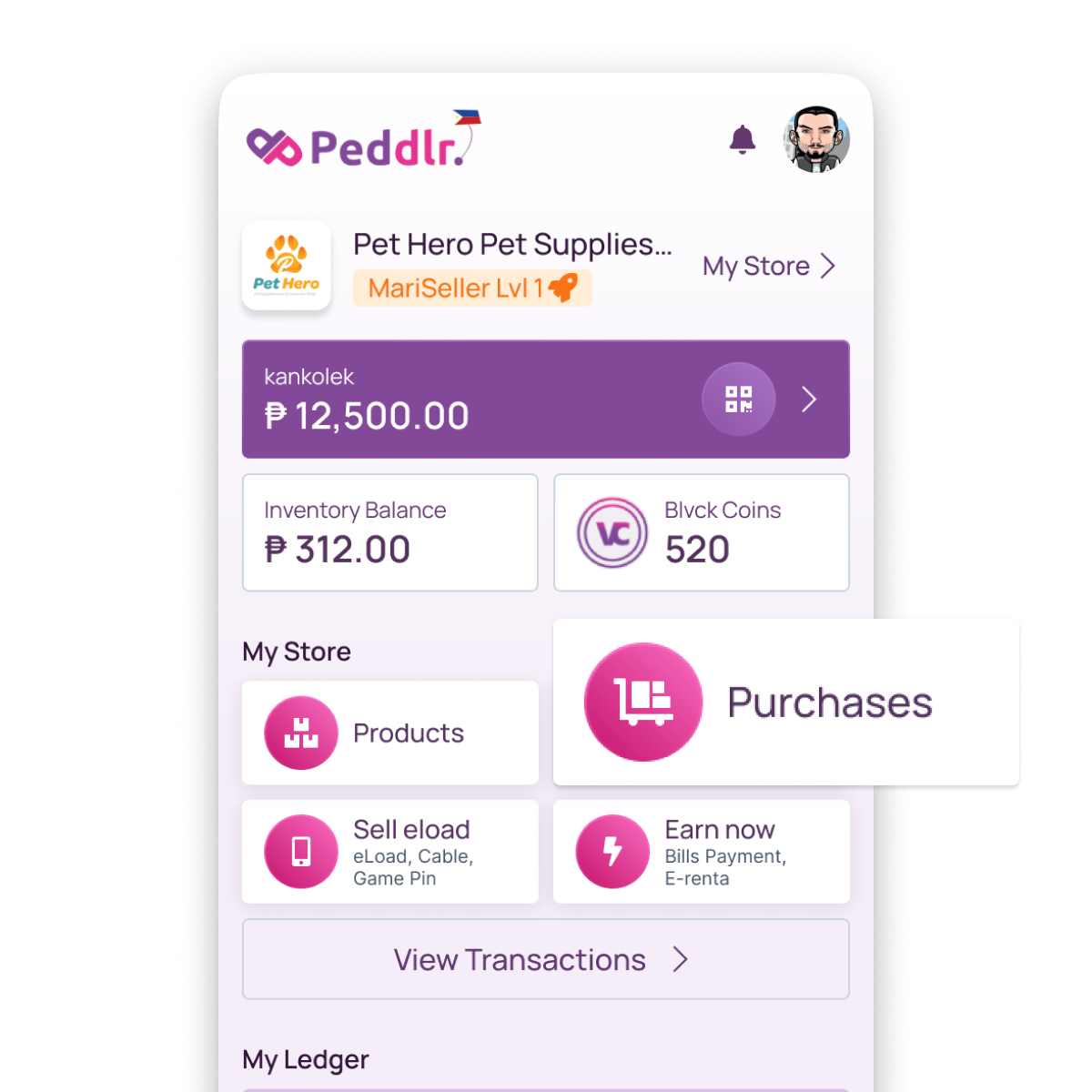
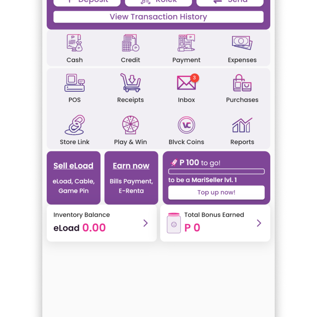
Peddlr is a mobile point-of-sale (POS) app designed to help micro and small business owners digitize their store operations. With many users being first-time digital adopters, the app must prioritize usability, clarity, and user confidence. As part of a design challenge for a job application, I took on the task of redesigning the Peddlr homepage to make it more intuitive and accessible. The focus was on improving layout clarity, establishing a stronger visual hierarchy, and creating a more task-oriented navigation experience.
The redesign was completed within a 3-day sprint. My approach began with auditing the existing user interface to uncover accessibility and usability issues. I identified key pain points, including cluttered navigation and hard-to-read icons, which hindered the user experience. From there, I prioritized improving layout clarity and visually grouping related functions to enhance comprehension. The final step involved prototyping and refining the new homepage design in Figma, ensuring it was ready for developer handoff.
Design Enhancements
From Clutter to Clarity: Enhancing Usability with Minimal Design
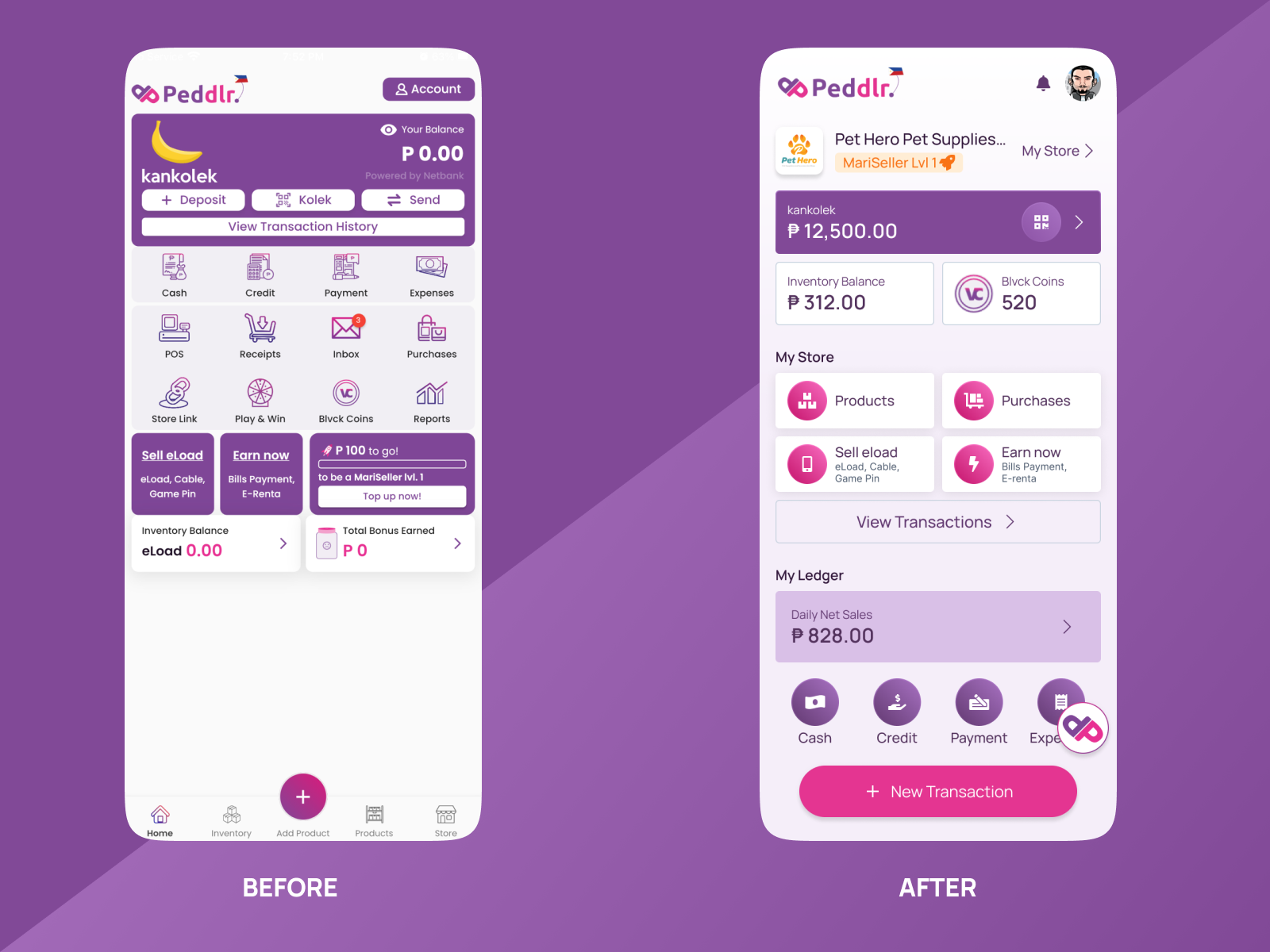
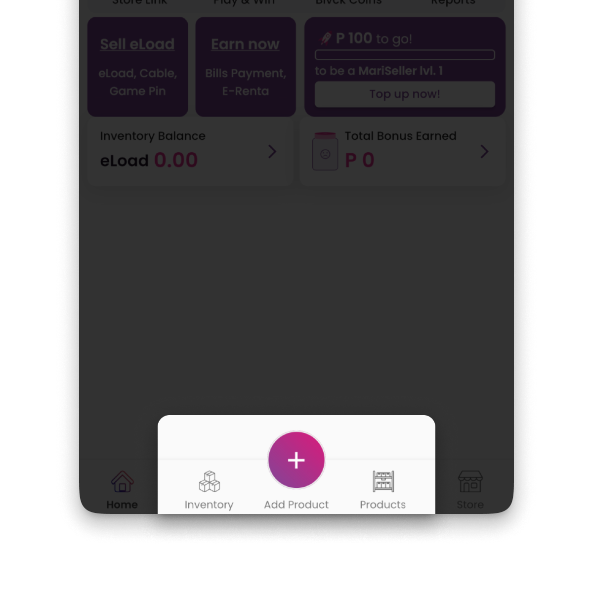
Removing Visual Clutter
Removed the bottom navigation bar and excess visual elements to create space and reduce distractions.
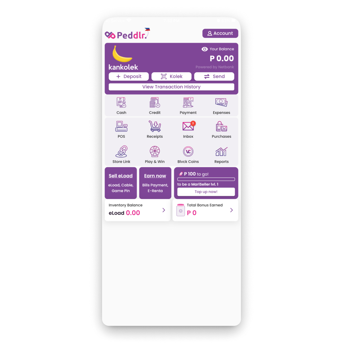
Simplifying Navigation
Consolidated related actions into clearly labeled, task-based buttons and menus, reducing cognitive load.
Improving Readability
Upgraded icon weight and contrast, and improved text legibility to support low-vision and first-time users.
Problem
Understanding the Barriers to Effective User Interaction
Poor Icon Legibility
Thin, low-contrast icons were hard to read, especially at smaller sizes and on lower-end devices.
Navigation Overlap
Redundant navigation led to confusion and slowed down task completion.
Solution
Translating Insights into Action
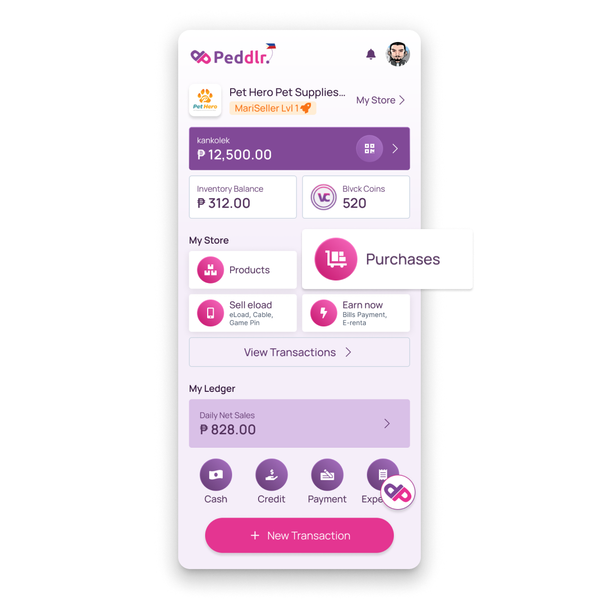
Decluttering the Interface for Better Focus
Replaced detailed icons with more legible alternatives and removed the bottom navigation to simplify the layout. This improved visual flow and made the interface feel less crowded.

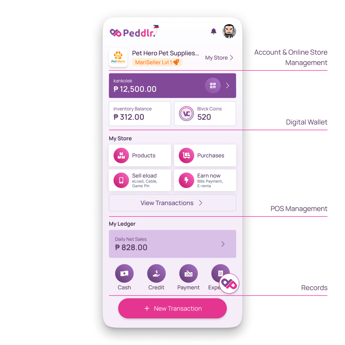
Structuring Navigation by User Tasks
Grouped core features into goal-based categories:
- Account & Online Store Management
- Digital Wallet
- POS Management
- Records
This made actions easier to discover, improving first-use experience and speeding up return usage.
This design challenge reinforced the value of minimalist design in real-world scenarios. By eliminating visual noise and aligning the layout with user goals, I was able to deliver a more accessible, clear, and empowering experience—especially for users in emerging digital markets.
This project also allowed me to demonstrate my ability to quickly identify problems, propose effective solutions, and execute with speed and clarity—key skills I bring to every design role.