Simplifying Shift Management
TL;DR: Overhauled a slow-loading mobile app to instantly load schedules, surface upcoming shift details at a glance, and enable one-tap clock-in—boosting caregiver efficiency by 40% and halving scheduling errors.
Company
Peddlr
Type
Internal UX Initiative
Role
Product Designer
Tools
Figma, Figjam
Timeline
2 week
Impact
+40% efficiency, –50% scheduling errors
ShiftCare is a mobile workforce management app for professional caregivers. Its original experience forced users into long, slow-loading lists and buried critical shift details behind multiple taps. Caregivers needed a faster, more reliable way to see and start their next shift—so they can focus on delivering exceptional care, not wrestling with the app.
We began by conducting contextual interviews with five caregivers, shadowing them on real shifts to understand where and why they missed details or ran late. Insights from these sessions drove a reorganization of the information architecture around a “Next Shift” priority, reducing navigation layers so the most imminent shift was always front and center. In Figma, we developed and tested interactive prototypes to validate the placement of key elements, such as the summary card and clock-in call-to-action. Finally, we iterated through three rounds of usability testing, refining copy hierarchy, icon clarity, and button placement until new users could view and start a shift in under eight seconds.
Design Enhancements
From Clutter to Clarity: Enhancing Usability with Minimal Design
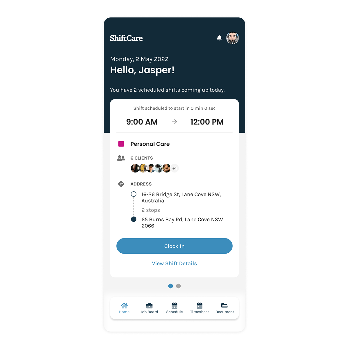
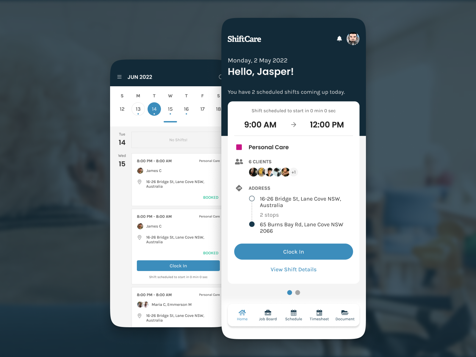
Next-Shift First
Elevated the summary card as the default view so caregivers land immediately on their most imminent shift.
Shift Summary Card
Consolidated time, client count, stops, and address into a single glanceable component.
One-Tap Clock-In
Positioned a full-width Clock In button within the summary card to enable users to start their shift with one tap.
Problem
Understanding the Barriers to Effective User Interaction
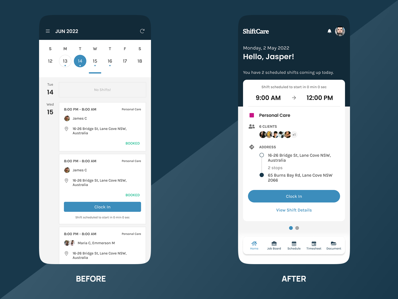
Slow Load
Long spinner delays before any shift data appears.
Hidden Context & Deep Navigation
Calendar is buried and clock-in requires multiple taps, leading to missed shifts.
Solution
Translating Insights into Action
Instant Loading
Optimized data fetching so shifts render immediately on app open, eliminating spinner delays.
At-a-Glance Context
Introduced a persistent horizontal calendar with a highlighted “today” underline to keep dates top-of-mind.
One-Tap Clock-In
Placed a full-width Clock In button in the summary card, allowing users to start their shift with a single tap.
This project reinforced the power of performance-driven UX. By aligning technical optimizations with user-centered design, we turned a bottleneck app into a seamless, one-tap shift manager—ultimately boosting both caregiver satisfaction and operational reliability.