Peddlr - Mobile POS Software
Peddlr is a free POS mobile app for small businesses. Effortlessly track and manage your sales, expenses, inventory, and transactions.
View in Figma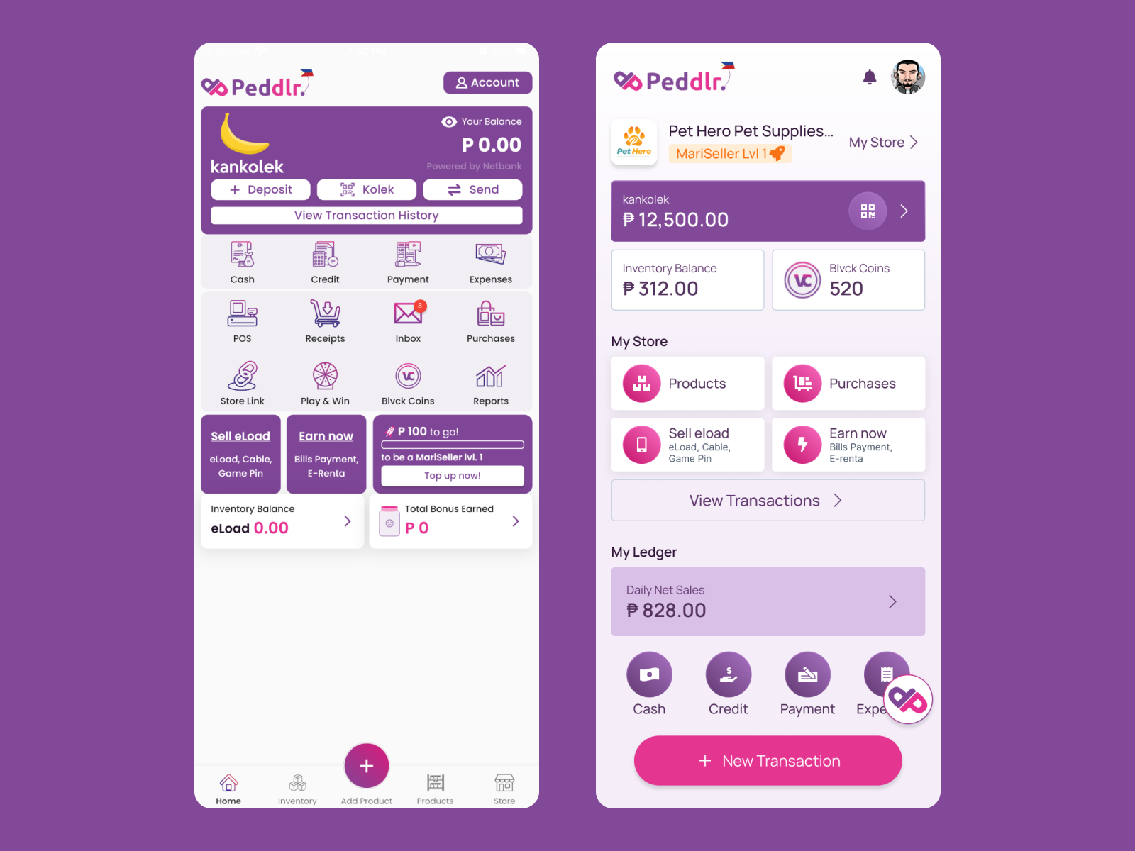
Problem Statement
The redesign of Peddlr’s homepage is a strategic initiative to enhance accessibility and usability for diverse users. The goal is to create a user-centric experience that caters to individuals with varying abilities and preferences.
My Observations
-
Color Contrast and Readability:
The current user interface (UI) of the application has several issues that impact its usability and accessibility. One major issue is the use of detailed icons with narrow strokes and gradient colors, which makes them difficult to recognize, especially in smaller sizes. This is particularly problematic for users with low vision or color blindness, as they may struggle to distinguish between different icons.
Another issue is the small text beneath the icons, which is caused by layout limitations. The limited space available for the text makes it difficult to read, especially for users with dyslexia or other reading difficulties. This can lead to confusion and frustration, as users may not be able to understand the purpose or function of the icons.
-
Simplified Layout and Navigation:
The navigation within the current user interface (UI) lacks cohesion, leading to a confusing and cluttered experience for users. There are multiple instances where similar icons lead to similar pages, creating redundancy and making it difficult for users to find the information they need quickly and easily. Additionally, there are instances where multiple pages could be merged into a single page, further decluttering the UI and improving its overall usability.
Another aspect that needs addressing is the lack of grouping for the icons based on their functionality. This makes it challenging for users to understand the purpose of each icon and how it relates to the overall navigation structure. Grouping icons by their functionality would create a more intuitive and organized interface, allowing users to find the features they need more efficiently.
My Solution
-
Decluttering the UI
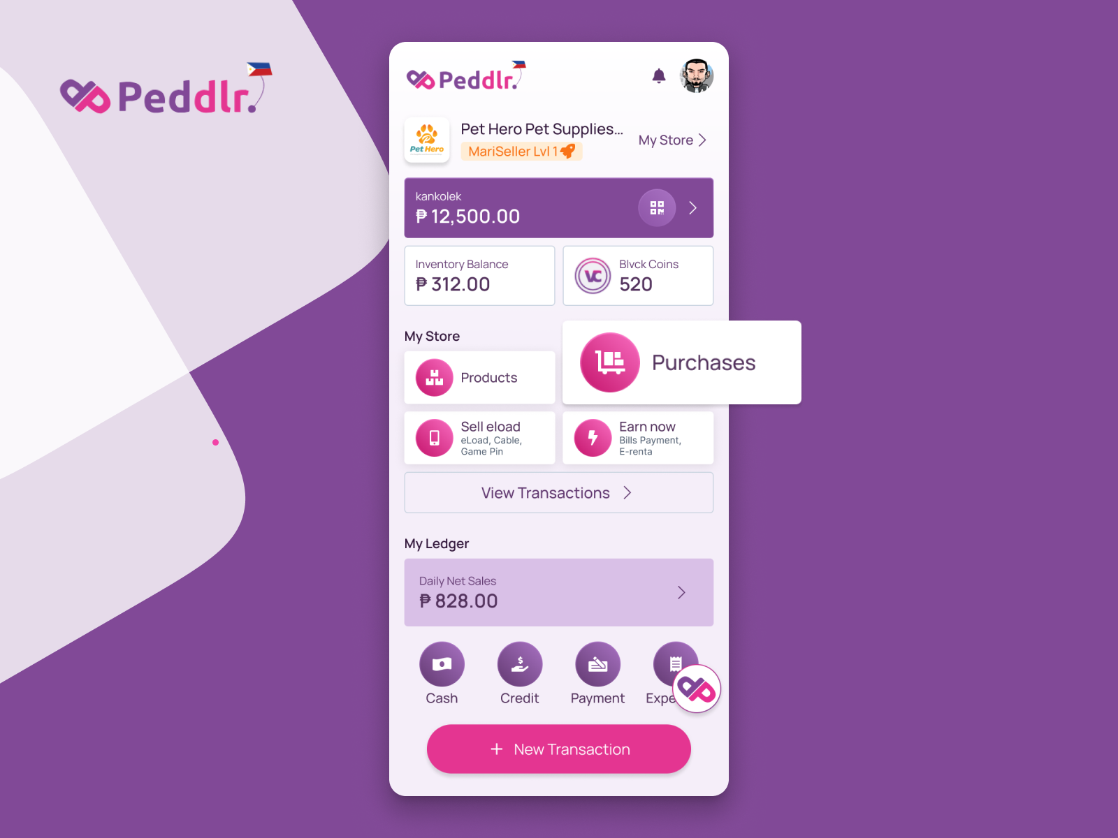
As part of the user interface (UI) redesign process, I undertook several strategic changes to enhance usability and streamline the navigation experience.
Firstly, I removed the navigation bar located at the bottom of the screen. This decision was made to create a cleaner and more cohesive layout, reducing visual clutter and improving the overall aesthetic of the interface.
Secondly, I reduced the number of navigation links. Rather than overwhelming users with an extensive list of options, I utilized other graphical elements, such as icons and intuitive menus, to serve as alternative navigation methods. This approach allowed me to maximize the available screen real estate, providing users with a more spacious and organized interface.
Furthermore, I emphasized the use of larger text and simpler, more recognizable icons in the navigational elements. This design choice aimed to reduce the mental load associated with navigation and make it easier for users to quickly and accurately identify the desired action or destination.
-
Organizing the Navigation Elements
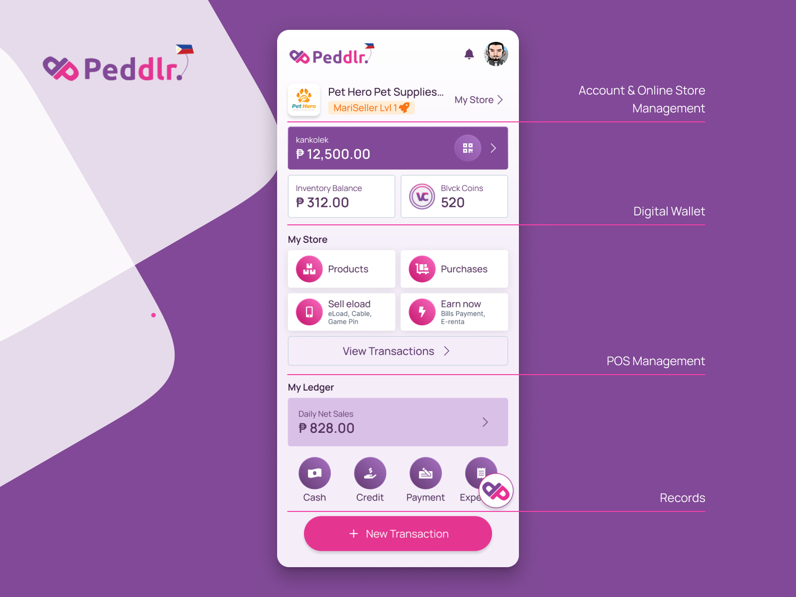
In order to create a user-friendly and organized interface, I meticulously divided the UI into four distinct sections:
- Account & Online Store Management
- Digital Wallet
- POS Management
- Records
By carefully sectioning the UI into these four distinct parts, I aimed to create an intuitive and seamless user experience, enabling users to navigate the interface efficiently and perform their desired actions without any confusion or frustration.