Designing an Inclusive Kitchen Display System for CloudEats
TL;DR: Over a one-week sprint, I redesigned CloudEats' Kitchen Display System (KDS) to better support color-blind users. Inspired by Trello’s color-blind friendly labels, I introduced a dual-coded visual system using both color and pattern. The result: faster order recognition, zero confusion, and a more inclusive kitchen experience.

Company
CloudEats
Type
Internal UX Initiative
Role
Lead Product Designer
Tools
Figma, Figjam
Timeline
1 week
Impact
Pattern-enhanced order status system for accessible, real-time order management
CloudEats operates multiple delivery-only brands out of shared, high-volume kitchens, and its Kitchen Display System (KDS) serves as the central hub for managing orders. However, by relying almost exclusively on color to indicate order status, the system became difficult for color-blind staff to interpret—especially during peak service hours when speed and clarity are critical. My goal was to redesign the KDS so that every team member could track orders accurately and efficiently, regardless of their type of color vision or the pressure of a busy kitchen environment.
To achieve this, I led a focused, accessibility-first sprint grounded in lean UX principles. First, I conducted on-site observations and interviews with staff across several CloudEats kitchens to understand real-world workflows and pain points. Next, I simulated various forms of color blindness to pinpoint where the existing interface failed. Armed with these insights, I audited the UI for its over-reliance on hue and lack of contrast, then prototyped a pattern-based status system—drawing inspiration from Trello’s color-blind-friendly labels—to supplement color cues with distinctive shapes and textures. Finally, I validated the new design through usability tests with both color-blind and neurotypical team members, ensuring that the updated KDS delivered clear, unambiguous order information under any conditions.
Design Enhancements
From Visual Guesswork to Fast, Pattern-Based Clarity
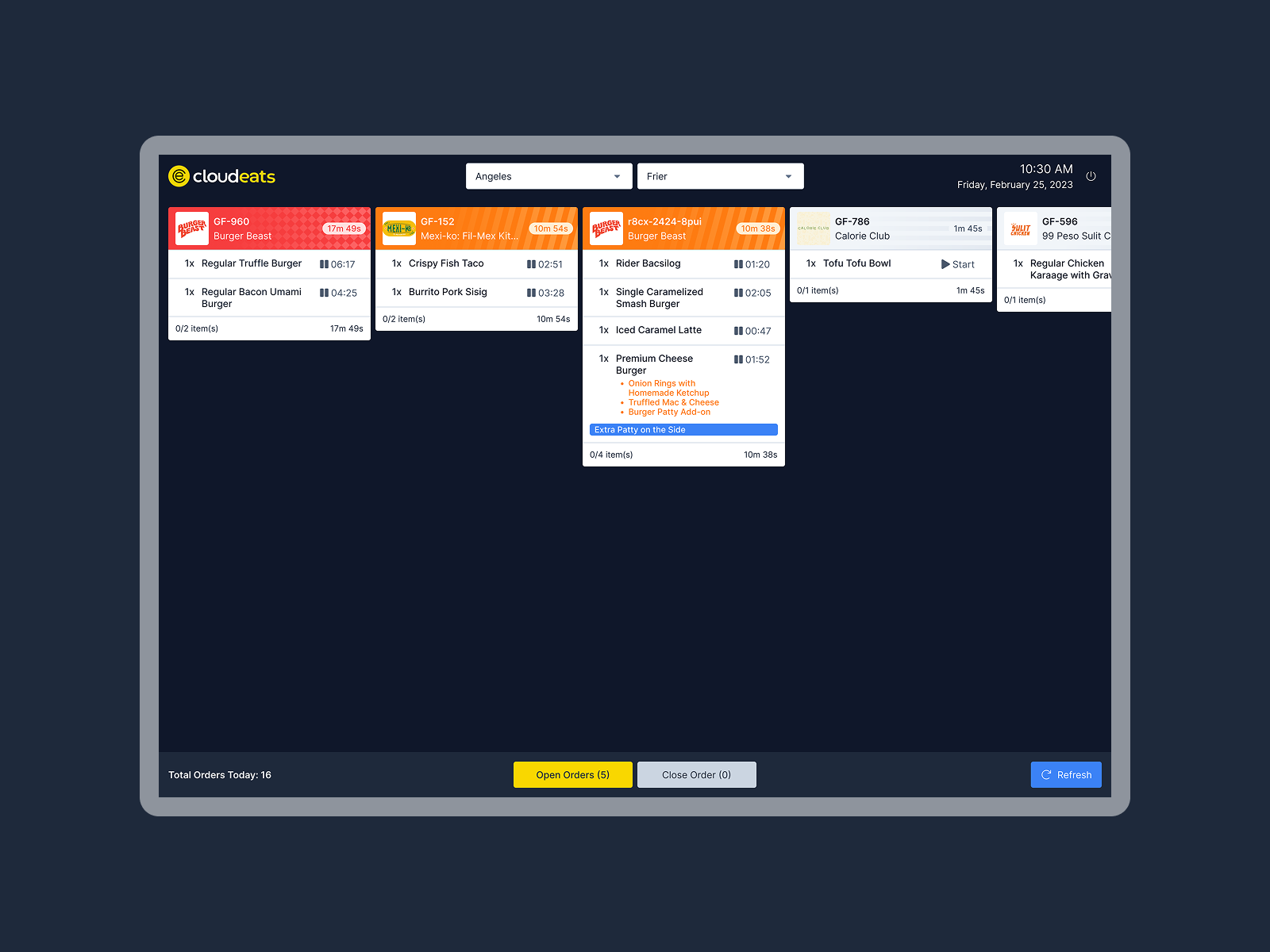
Redundant Visual Cues
Introduced pattern overlays for each status (e.g., stripes, dots, grids) in addition to color, making states unmistakable under any vision condition.
Contrast and Icon Clarity
Enhanced UI contrast and icon visibility to support quick scanning in dim kitchen environments.
Inclusive by Default
Rolled out the new visual system across all KDS screens without requiring users to toggle accessibility modes—baking inclusion into the base experience.
Problem
Why the Original Design Didn’t Work for CloudEats' Color-Blind Staff
Status Confusion During Rush Hours
Users with red-green or blue-yellow color blindness struggled to distinguish key states like “In Progress” vs “Ready.”
Low Lighting + Speed = Errors
Poor visibility combined with high-pressure workflows led to frequent misreads and order delays.
Solution
Trello-Inspired Pattern Tags for Clear, Inclusive Order Management
Patterned Status Overlays for Immediate Recognition
Each status now uses a unique, high-contrast pattern:
Simplified Visual Hierarchy
Reduced visual noise and grouped critical actions near order cards. This allowed faster processing regardless of screen familiarity or visual acuity.
Designing for color blindness at CloudEats reminded me that accessibility and performance aren’t at odds. By borrowing from proven models like Trello and grounding decisions in real kitchen feedback, we created a system that feels smarter, faster, and more fair for every team member.
This project also reaffirmed my belief in inclusive design as a baseline—not an optional layer.